A Widening Gap Between Data and Headlines in Senior Housing

May 19, 2026
Updated: June 18, 2026
The senior housing sector is performing well. Occupancy is rising, rate growth remains above historical norms, transaction pricing is nearing prior-cycle highs, and new construction is constrained. On the surface, the story seems straightforward.
A closer look shows something more complex.
The headline numbers still point in the right direction. What has changed is how much they conceal. As conditions tighten, averages are becoming less useful on their own. The more relevant signals now sit in the spread between market medians and totals, where supply has stalled, and in which geographies are pulling ahead.
The Data Gap Is Telling a Different Story
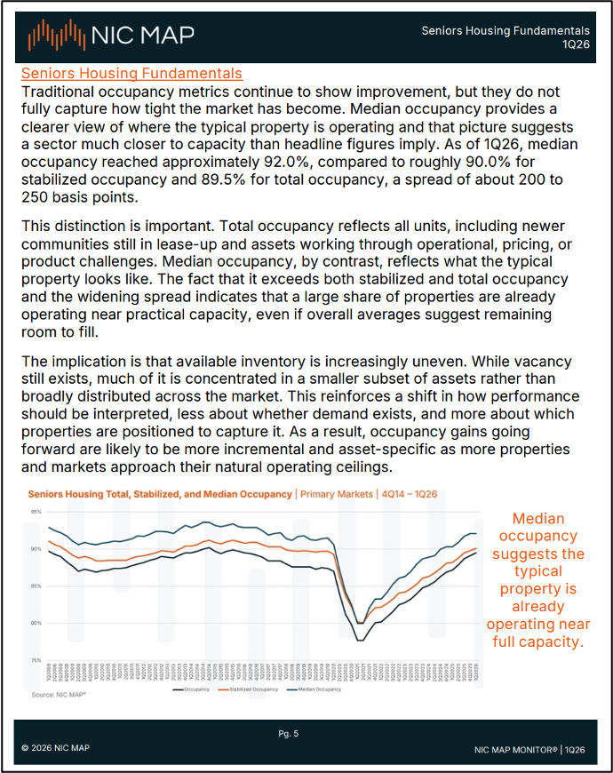
Median occupancy in primary markets has climbed to roughly 92.0%, while total occupancy sits closer to 89.5% — a gap of 200 to 250 basis points.
That spread matters. It indicates that the typical property is already operating near practical capacity, even though the broader average still implies room for occupancy gains. Available inventory is no longer distributed evenly across the market. It is concentrated in a smaller share of properties, while most communities are already running tight.
The practical consequence is that operators, investors and lenders relying only on total occupancy risk understating how constrained much of the market already is. The average still suggests room to run. The median suggests something much closer to stabilization — a market less in the filling phase and more in the operating-near-capacity phase, which changes the case for what realistic occupancy upside looks like over the next several quarters.
The Supply Pipeline Is Not a Short-Term Story
The senior housing pipeline points to the same conclusion: current tightness is not temporary.
Three of the last four quarters recorded fewer than 1,000 net units added across primary markets. Start volumes now sit near the lowest levels in NIC MAP’s recorded history. And because senior living construction trends move slowly from groundbreaking to opening, the effect of that slowdown extends well beyond the next few quarters.
This is a fundamental supply condition, not a weak stretch in starts. Even if capital availability improves or development interest returns, the near-term supply response is limited by the duration of the development cycle itself. That keeps new competitive inventory constrained through 2026 and likely beyond — sustaining current occupancy dynamics and limiting new supply’s ability to absorb existing demand, and arguing for less weight on near-term supply risk in underwriting and more attention to acquisitions and repositioning as the more available near-term path to expansion.
Secondary Markets Are No Longer Following
The geographic pattern of this cycle is shifting as well.
Secondary markets crossed 90% occupancy in 2025 and are showing stronger asking-rate trends than primary markets across both independent living and assisted living. The long-held assumption that primary markets lead and secondary markets follow no longer holds in this cycle. Demand strength is broader-based than the major-metro narrative captures.
At the same time, a growing share of primary markets are posting flat or negative inventory growth. In some cases, the issue is no longer just slow expansion — it is supply contraction. That is a meaningful change in market structure, especially in a sector where new development has historically absorbed tightening fundamentals.
Strength is spreading across geographies, but it is doing so unevenly.
What This Means in Practice
These are not isolated statistics. They are connected signals about how the sector is functioning, and they point to a market where the average tells you less than it used to. Decisions in this environment hinge on differences, not averages — which markets are tightening fastest, which care types are showing the strongest absorption, where supply constraints have shifted from limiting to largely absent.
For operators, that shapes staffing, capital allocation, and operating assumptions. For investors and lenders, underwriting, portfolio construction, and where the next dollar goes. Broad market strength is helpful, but local conditions are increasingly what determine where demand is absorbing, how quickly occupancy can move, and what fundamentals actually look like beneath the headline.
The traditional approach to sector reporting — summarize the headline trends, move on — works when the market is moving together. When it doesn’t, the value needs to shift to understanding where to look and what it points to.
The Role of the NIC MAP Monitor
That is the perspective the NIC MAP Monitor delivers.
Published quarterly, the report synthesizes NIC MAP data across fundamentals, care types, markets, transactions, and development into an executive-level view of the sector. Each issue moves past summary, connecting what the data is showing to the decisions it should inform — whether that means revisiting operating assumptions as the typical property nears practical capacity, or rethinking how much weight near-term supply risk should carry in underwriting. It includes insights from the 74 new NIC MAP markets, bringing more than 240,000 units and beds across the next tier of investable local geographies into the same analytical view
For two decades, NIC MAP has served as the source of record for senior housing and care data. The MAP Monitor turns that depth into the connection points decision makers need to act on what the data shows
The 1Q26 issue is live now in the National Reports section of the NIC MAP platform.